
Tesla V11 Software Review: Complicated Simplification
I’ve had Tesla’s newest software version on my 2019 Mid-Range Model 3 for enough time now to have a good grasp of what it’s like living with this vision of a car driving experience. With a good amount of miles under my belt on good ole’ Southern California freeways, I’ve come to the conclusion that the V11 update is complicated to judge due to its oversimplification of aesthetics. Confusing right?
While V10 was a transcending update to the lifestyle of how a Tesla operates, if we were to look at it in the realm of technology OS history, I find it somewhat similar to when Google dedicated an entire Android version to Material Design. It was an update that made the operating system easier on the eyes by simplifying and decluttering many of the functions that polluted space like buttons on a remote. The initial public reaction to the evolution of that OS was a bit negative as was when Google began shifting away from the three button navigation towards full swiping. While there will always be reluctance to change, people do eventually adapt and learn to appreciate and understand why companies alter their way of life.
The Big Changes

The V11 update seemingly disrupts more than it does improve if I’m being honest. After the initial awkward counter-muscle memory period wore off and I accepted the function relocations, I can make the bold claim that for every thing Tesla did right in V11, there are 2 things that needs tinkering.
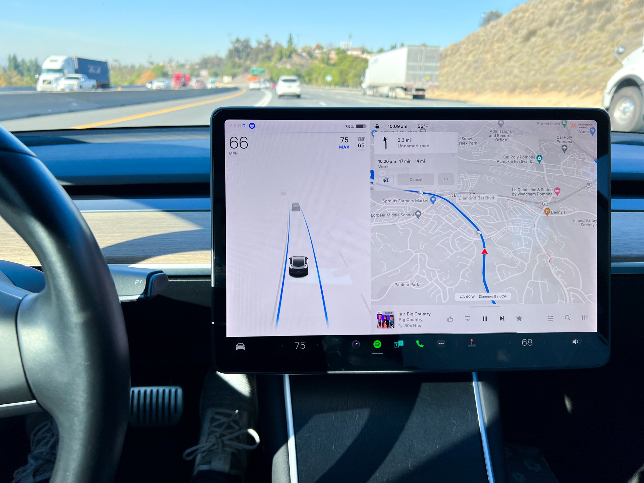
We’ll start with the glaringly obvious alteration which is the bottom dock that formerly housed most of your quick-settings like volume and temperature. Those two are still around, but the seat heater controls and various other functions like the driver profile and defroster are now relocated inside the menu. This is a major change in user experience as it does completely change the way a driver interacts with the vehicle. It’s currently the winter season and my seat heater is constantly being tinkered with. Now that it’s hidden behind a menu, it actually takes multiple presses before completing a simple task such as changing the heat from 3 to 2. The same situation now occurs when changing the driver profile. The profile button was situated on the top right corner of the interface for a few iterations, but now requires entering into the menu screen to change drivers. This went from a 2 press action into a 3. While the press count increase isn’t necessarily an issue, there now needs to be guided attention to where the finger goes to enter into these areas. That does somewhat bring the driver’s attention away deeper into the screen.
A Computing Car

There are some benefits however with some of the relocation of assets. The Homelink button now fills up the bottom left corner of the UI when approaching a registered location. It was originally located all the way across the screen in a tiny green icon which did require a bit of precision to reach. This wider and closer Homelink button is now more convenient in its new location. The distance and accuracy of the Homelink reception seems to have improved as well based on my daily usage.
The app dock now resembles that of a modern computing interface. Apps have a clean icon that looks like it could be from the Apple App Store. We’ve finally transitioned to a computing driving interface all the movies have been fantasizing about for decades. While I do like the aesthetic direction Tesla is going towards with the application implementation, there are still some drawbacks to the new way of doing things. For one, there’s only four slots available in the dock for drivers to customize their layout. This is an issue because audio media consumption is now accessed by their apps and no longer meshed into one player. While you can switch between the apps within the player itself (like the driver profile section), it now takes some additional finger precision that takes attention off the road. This could be more manageable if Tesla allowed for more than 4 apps on the dock. As it is now, I do surmise most of us will have the camera app and the phone app occupy two of the slots with either Spotify or another media app taking the other slots. This kind of forces the user to consolidate their source of driving entertainment into one app like Spotify for both music and podcasts.
How to Fix This
While Tesla has certainly glorified the aesthetic experience of the UI, it did come at a cost in terms of functionality. This isn’t a “give it some time” case. I’ve put enough miles on the car in all three versions of the Tesla software we’ve had in order to understand what works and what doesn’t for this type of car. I see Tesla going in the right direction, however, the execution just isn’t intuitive enough to be a permanent way of life. There’s no way Tesla won’t be pushing implemental updates to make things more functional. After experiencing so many different UI changes in the tech world over the last decade, one interesting way to solve decluttering would be something like the “Edge Panels” on Samsung or other Android devices. A quick swipe from the side brings out a pane of quick settings as an overlay unit for instant adjustment. It’s a simple solution. Here’s hoping for a point update in the near future that addresses these things.
Related


Alex
With nearly a decade under his belt running his video production team, and countless hours traveling the country to report on pop culture events during his tenure as a contributor for AXS Examiner, Alex has relied on a lot of gadgets over the years. That still hasn’t satiated his need to get his hands on the newest and greatest the world has to offer!